What Wallpaper Styles Suit Your Profession? Match Visual Design to Your Work Rhythm
Different professions demand distinct cognitive needs and emotional rhythms. Drawing on environmental psychology and human factors engineering, this article explains how wallpaper styles align with the work lives of programmers, teachers, doctors, and more—and offers practical selection principles.
We spend over six hours daily in front of screens—and the wallpaper at the center of our vision is no longer mere decoration; it’s a silent environmental regulator. Psychological research (e.g., the visual environment stress experiment published in Environment and Behavior, 2021) shows that prolonged exposure to high-stimulus, high-contrast, or semantically chaotic background images significantly raises cortisol levels and weakens focus and emotional recovery. In contrast, wallpapers aligned with professional cognitive rhythms and psychological needs subtly reduce cognitive load and deepen task immersion. This isn’t mysticism—it’s empirically validated human factors engineering and environmental psychology: profession shapes thinking patterns, and thinking patterns call for matching visual grammar.
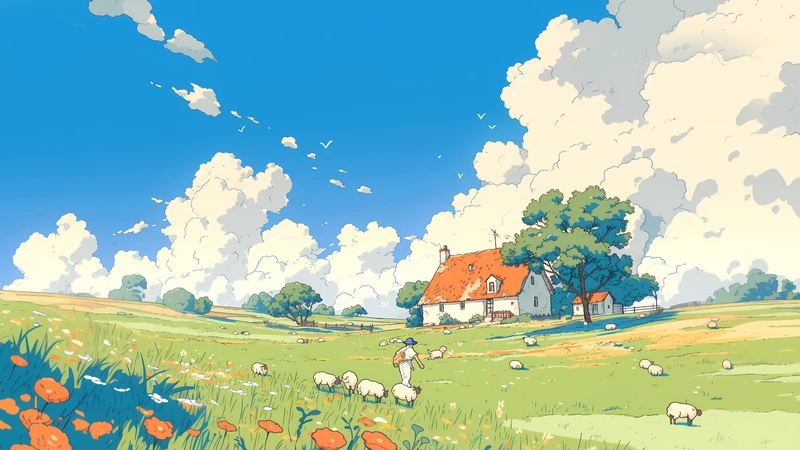
Creative professionals—such as graphic designers, illustrators, and copywriters—rely on frequent divergent thinking and metaphorical association. Their ideal wallpaper isn’t ‘quiet’—it’s an ‘inspiration trigger with room to breathe.’ Soft watercolor gradients, hand-drawn linework, and compositions rich in intentional negative space avoid visual competition while embedding subtle narrative cues. That’s why natural motifs from Studio Ghibli films—wind-swept grasslands, drifting clouds, wooden cottages—are widely embraced by creative workers: they balance childlike poetry with meticulous detail, neither overwhelming the nervous system nor failing to offer gentle visual metaphors. Bonus recommendation: Wallpaper pack ‘A0196-Healing Illustration _ Studio Ghibli Style’ is curated precisely for this need—low-saturation teal-greens and warm browns interweave softly; characters are understated, never loud; each image feels like an unwritten fairy-tale manuscript, quietly awaiting your spark of inspiration.
Programmers, data analysts, and algorithm engineers operate in intense logical loops. Their minds require ‘controllable order’: clean grids, restrained color gradients, and interference-free geometric structures. Overly literal or emotionally charged imagery creates unnecessary cognitive friction. Research (MIT Human Factors Lab, 2022) found minimalist wallpapers using neutral grayscale with a single muted accent color improved error detection speed during coding by 11%. Deep navy backgrounds with faint circuit-line textures, matte concrete surfaces overlaid with subtle pixel grids, or abstract data-flow diagrams arranged via golden ratio—all are far from cold emptiness. They’re visual rails laid down for rational thought.
Educators—especially K–12 teachers—navigate multitasking, high-emotion work environments. They need wallpapers that convey ‘steady, gentle presence.’ Soft warm tones, rounded forms, and growth-oriented visual elements (e.g., sprouting branches, stacked books, side-by-side chalk and plants) gently ease occupational burnout. Crucially, such wallpapers should avoid excessive ‘infantilization’ (e.g., cluttered cartoon animals) and retain adult aesthetic dignity—because teacher identity rests equally on compassion and professional authority.
Healthcare and counseling professionals operate within the tension of deep empathy and boundary maintenance. Their wallpapers should express ‘gentle detachment’: matte textures, low-reflectance tones, and asymmetrical yet balanced compositions. Think: a half-open window framing distant mountains veiled in mist—or a plain ceramic bowl holding still water and a single sunken stone. These scenes tell quiet stories without inviting interpretation; they radiate warmth without demanding response. This visual language functions like silent self-regulation: open, yet safeguarding inner space.
Administrative, legal, and finance professionals rely on stability, precision, and temporal order. Ideal wallpapers feature vertically or horizontally dominant structures (e.g., neatly aligned bookshelves, layered folder silhouettes, sundial shadows), neutral palettes (oatmeal, terracotta gray, aged paper white), and avoid motion blur or tilted imbalance. A precisely aligned minimalist calendar wallpaper delivers far more than decoration—it reaffirms ‘predictability’ daily, serving as a small but vital anchor against workplace uncertainty.
Interestingly, significant variation exists even within the same profession. A remote UX researcher may prefer scene-based wallpapers bearing human traces (a coffee cup beside open user interview notes), while an office-based HRBP might lean toward symbols of connection and balance (interlocking rings, bridge silhouettes, handshake-shaped negative space). ‘Occupational wallpaper’ is thus not a rigid label—but a personalized visual prescription, extending from core job tasks into individual work styles, collaboration modes, and energy rhythms.
Finally, remember: wallpaper belongs to your environment—not its star. It shouldn’t compete for attention, but instead serve as an invisible support during deep focus and a tender retreat when weary. Changing your wallpaper regularly is a lightweight environmental therapy practice—just like tidying your desk or adjusting lighting: one of the most pragmatic acts of self-care for working professionals. Next time you switch, pause for three seconds and ask yourself: What does my mind need right now? Order? Space? Warmth? Or a poetic corner where it can briefly rest? The answer lives in the hue and line you choose.
Recommended Wallpaper Packs
Related Articles
Match Morning Routine with Calming Wallpaper in 3 Steps
Match your calming wallpaper to your natural morning rhythm in 3 intentional, ac...
Evening Wind-Down Wallpaper Guide: 3 Simple Steps with test20260120
A practical 3-step guide to choosing calming evening wallpapers — tailored for r...
Wallpaper Gift Guide: A Thoughtful Digital Present
Wallpaper packs are emerging as emotionally rich digital gifts. This guide cover...