Blue Wallpaper Calm: How Ocean Tones Quiet Your Mind
How ocean-tone blue wallpapers reduce stress and sharpen focus—backed by color psychology and real-world calm.
You’re halfway through your fourth Zoom call of the day—shoulders tight, jaw clenched—and then you glance down at your desktop. There’s that quiet alpine lake, perfectly still, reflecting snow peaks. For two breaths, your pulse slows. You don’t click away or close a tab. You just see it—soft cerulean bleeding into misty silver, water so clear it dissolves the line between sky and surface. And something in your chest unspools, almost imperceptibly. That’s not coincidence. It’s biology meeting beauty—quietly, without fanfare.
Why Your Brain Stops at Blue
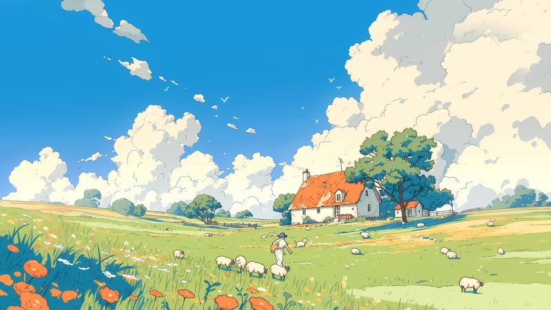
Blue doesn’t shout. It settles. When your eyes land on a true ocean tone—think mist-laced aqua, deep lapis softened by morning light, or the hushed gray-blue of a rain-slicked harbor—your nervous system registers it before your thoughts catch up. This isn’t poetic license. It’s parasympathetic activation: your heart rate dips, breathing deepens, cortisol softens like sugar in warm tea. You don’t need to meditate. You don’t need to pause. Your body simply responds—like stepping into cool shade after walking under midday sun.
Ocean tones do more than generic blue. They carry depth without demand. A flat, solid navy feels anchored—but static. A teal with a whisper of green holds memory: seaweed swaying just below the surface, kelp forests breathing slowly in the current. Misty aqua adds atmospheric perspective—the kind that makes your gaze linger, not scan. That gentle visual ‘pull’ reduces ocular tension, lowering the background hum of digital fatigue. Your eyes aren’t working to parse sharp edges or competing contrasts. They rest—like sinking into water that holds you, but never pulls you under.
This is why hospital waiting rooms lean into pale blues, why therapy offices favor soft seafoam walls, and why architects specify cerulean tiles in meditation spaces. Not because blue is ‘pretty’—but because it’s physiologically hospitable. It meets your nervous system where it is, not where you wish it to be.
The 3-Minute Reset You’re Already Missing
You’ve probably dismissed your wallpaper as decoration—or worse, an afterthought. But what if it’s actually your most frequent micro-intervention? Think about it: you open your laptop 12–20 times a day. You switch between apps dozens of times hourly. Each time, your screen flashes back to its default state—and that’s when your wallpaper appears. Not for five minutes. Not during a scheduled break. But in those half-second glances while waiting for Slack to load, while your calendar app refreshes, while you hunt for a file icon in the corner. These are passive exposures—brief, involuntary, utterly unforced.
And yet, they add up. Research in environmental psychology shows that even brief, incidental contact with restorative visual cues—like natural color palettes or softly layered depth—lowers cognitive load within seconds. Your brain isn’t trying to interpret the image; it’s recognizing a familiar signal of safety: water, horizon, stillness. That recognition releases subtle neurochemical relief—dopamine smoothing out stress spikes, alpha waves rising just enough to quiet mental chatter.
That’s why a well-chosen blue wallpaper works better than a mindfulness app notification you ignore. It doesn’t ask for attention. It gives calm—quietly, consistently, without friction. It’s the digital equivalent of hearing distant waves from your balcony: no effort required, no intention needed—just presence, met with peace.
Not All Blues Are Calming: What to Avoid
Not every blue soothes. Some agitate. Some exhaust. And many of them live on your screen right now—masquerading as serenity.
Electric blues—vibrant cobalt, neon azure, high-gloss cyan—activate alertness. They’re brilliant for logos, notifications, or action buttons because they spike attention. But as a backdrop? They keep your visual cortex humming, subtly raising arousal. You might feel ‘focused,’ yes—but also wired, restless, or strangely impatient. It’s the difference between sitting by a quiet bay and standing under a strobe-lit nightclub sign.
Then there’s the cold, sterile blue—the kind that bleeds from over-bright monitors or defaults in early operating systems. Think harsh, flat #007AFF or icy digital blue light. It lacks warmth, texture, or organic variation. No hint of cloud, no ripple of reflection, no gradation from deep to soft. Your brain reads it as artificial, clinical, even slightly threatening—like fluorescent lighting in an empty corridor. It doesn’t invite rest. It signals utility. And utility, in emotional terms, often reads as urgency.
Calming blue needs breath. It needs nuance: a whisper of gray in the undertone, a touch of green in the depth, a soft fade where light meets shadow. It should feel like something you could dip your fingers into—not something you’d see on a warning label.
When Stillness Meets Motion: The Japanese Landscape Effect
Which brings us to the quiet magic of the Japanese Landscape 8K Ultra HD Desktop Wallpaper Pack—not as a product, but as a carefully tuned emotional instrument.
The first image—a crystalline alpine lake nestled beneath snow-dusted peaks—is built on mirrored stillness. The water doesn’t shimmer violently. It holds. It reflects the mountains so precisely your eye blurs the boundary between earth and sky. This isn’t just pretty composition. It activates mirror neurons—the same neural circuitry that helps us empathize, attune, and settle into shared calm. When you look at perfect reflection, your brain simulates stillness. It doesn’t just see quiet—it begins to embody it. Your posture softens. Your blink rate slows. Even your peripheral vision quiets, as if the whole frame has drawn a collective breath.
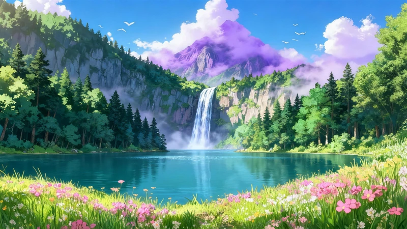
The second wallpaper—a cascading waterfall in a misty mountain valley, rendered in soft anime-style artistry—introduces rhythm without rupture. Water flows, yes—but gently, in layered ribbons, not crashing torrents. Lush greenery blurs just enough at the edges to soften focus, inviting your gaze to drift rather than fixate. There’s motion, but no urgency. There’s detail, but no clutter. It’s the visual equivalent of listening to rain on a tin roof: constant, soothing, effortlessly grounding.
Together, these two images form a dynamic duality: one teaches stillness; the other teaches flow. One invites pause; the other supports sustained attention. Neither demands interpretation. Both reward lingering. And because they’re rendered in true 8K ultra HD—crisp enough to see individual pine needles in the mist, deep enough to hold shadow without noise—they avoid the visual fatigue of pixelated or oversharpened nature imagery. No jagged edges. No artificial saturation. Just light, water, stone, and air—arranged with the quiet intentionality of a Zen garden.
You don’t need to ‘use’ them. You just need to let them be there—behind your emails, beneath your spreadsheets, framing your creative work like silent companions. Over days, you’ll notice the shift not in grand gestures, but in small surrenders: the moment you exhale before replying to a tense message, the way your shoulders drop when switching tabs, the pause before you reach for caffeine—not because you remembered to breathe, but because your screen reminded you, softly, without words.
There’s a reason ancient cultures placed water features at thresholds—to mark transition, to cleanse intention, to signal safety. Your desktop is your modern threshold. Every time you open it, you cross into a space of thought, labor, connection. Why not meet that threshold with something that says, You can slow here. You can breathe here. You are held here.
Not all calm is loud. Not all healing arrives with ceremony. Sometimes, it’s just the quiet lap of color against your periphery—the soft echo of ocean tones in a world that rarely whispers. You don’t need to change your schedule. You don’t need to download another app. You just need to choose what meets your eyes—again and again—and let it do its quiet, cumulative work.
So tonight, before you shut your laptop, try this: open your desktop settings. Swap out the default. Choose a blue that breathes. One that holds space instead of filling it. One that feels less like decoration—and more like a sigh you didn’t know you were holding.
Because calm isn’t something you chase. It’s something you make room for—pixel by pixel, breath by breath, still lake by still lake.
Related Articles
Nature Scenery Wallpapers for Stress Relief at Work
How nature scenery wallpapers lower stress at work — with practical steps, scien...
How to Choose Deep Work Wallpapers: A Step-by-Step Guide
A practical, step-by-step guide to choosing wallpapers that reduce distraction a...
Calm Laptop Wallpaper Guide: Turn Your Screen into a Sanctuary
Practical guide to choosing laptop wallpapers that support focus, transition, an...